Editorial Design: A Closer Look at Cipe Pineles

I wanted to take a closer look at Cipe Pineles because I feel like her work is extremely interesting and pretty brilliant. I feel like her name is kind of forgotten by people (including myself), but her work – well, everyone knows it. I wanted to dig deeper into her life and her influences and how she got her start.

Born in Austria in 1908, Cipe Pineles would be one of the most influential women of graphic design and art direction during her time. After graduating from Pratt University, Pineles was offered a job at Contempora Ltd (Condé Nast publications), right out of school, where Condé Montrose Nast himself (founder and publisher of other magazines like VogueVanity Fair, and The New Yorker) saw great potential in her. By the 1930s, Nast got Pineles jobs at Vogue and Vanity Fair, where she learned editorial direction first-hand from M.F. (Mehemed Fehmy) Agha, the art director of Vogue, Vanity Fair, and House and Garden. By 1943, she got her start in New York as the first woman art director of Glamour magazine – a “mass-market American publication.” Pineles would continue her big career as art director of magazines like Seventeen, and Charm. She would continue to put her mark on these big magazines.

Below are a couple of designs done by M.F. Agha for Vogue magazine in 1932. Although he has a completely different approach to his designs (more illustrative), you can see the influence he had on Pineles. As a result of overseeing and working directly with Agha, Pineles picked up on his minimal, simplistic, and clean approach to design.


While Pineles was learning the ins and outs of graphic design and editorial design from Agha, she worked on several covers for Vogue. She was given a lot of freedom while working there because they didn’t have a logo. Agha encouraged his workers to experiment with things and find something that spoke to them, something that they were good at. Pineles found that she was interested in photography and she was exceptional at it. It was actually perfect, too, because photography took the place of fashion illustrations – so her talent was wanted…and pretty much essential at this time. Agha forced Pineles to be the best she could be. Pineles says: “Agha was the most fabulous boss to work for. Nothing you did satisfied him. He was always sending you back to outdo yourself, to go deeper into the subject.”

Cipe Pinele, Vogue Magazine Covers, 1939

WIth the help and preparation of Agha, Pineles became art director of Glamour magazine in 1942. Pineles had some of the best photographers (Andre Kertesz, Herbert Matter, Cornell Capa, Toni Frissel, and Trude Fleischmann) and several designers and artists of that time work with her to make it that much better.

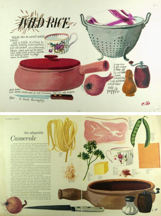
During the time of World War II, Pineles began working as the art director of Seventeen magazine, which had only been around for three years prior. Very much like today, the audience of the magazine was teenage girls. The founder and editor of the magazine, Helen Valentine, didn’t want the magazine geared toward “silly, only-marriage-minded girls,” she wanted it directed toward “serious and intelligent young adults.” As a result, Pineles moved the magazine in a different direction. She had some of the best illustrators (including herself) bring different things to the attention and interest of the young public like food, household items, furniture, etc. She also brought more playful typography and visual puns to her designs.


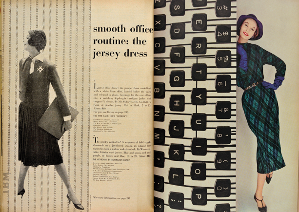
In 1950, Pineles left Seventeen to go to Charm magazine. The magazine was geared toward the working woman and had pages on knowledge, money, and their futures – and of course the usual beauty and fashion concerns that women had. While still addressing these things, Pineles also made sure to include the values of women as well as the changing roles in men and women (at home and in the workforce). One of the main focuses of the magazine was on fashion for the working women (at the office, commuting, lunch-hour shopping, etc).


Pineles went on to work as an art director for Mademoiselle and in 1961, she became an independent consultant designer and teacher of design. Pineles taught editorial design at Parsons School of Design up until the mid 1980s. She taught her students how to become successful art directors and gave them “real world” projects to prepare them for the editorial world. Up until Pineles retired and later passed in 1991, she had received countless awards and had been inducted into the Art Directors Hall of Fame.

I find Pineles’ work – and her direction in art – so fascinating. Her work changed so much over the course of twenty years (or more). Being a graphic designer myself, I find it really interesting how she’s been in the public eye (and their actual hands) for so long. I feel like she had such a big impact on editorial design and brought a completely different side to it – that was never really seen before…and hasn’t really been seen today.


Sources:

“Cipe Pineles.” The American Institute of Graphic Arts. 1998. Web. 4 April 2014. <http://www.aiga.org/medalist-cipepineles/>.

“20th Century Editorial Design: Cipe Pineles.” RIT Graphic Design Archive Online. Web. 4 April 2014. <http://library.rit.edu/gda/designer/cipe-pineles>.

“Badass Lady Creatives [In History]: Cipe Pineles.” Designworklife. Web. 4 April 2014. <http://www.designworklife.com/2014/01/22/cipe-pineles/>.

Meggs, Philip B. “Megg’s history of graphic design.” The New York School. Hoboken, New Jersey: John Wiley & Sons, Inc., 2012. Print.

The Isotype Movement: Change in Pictograms

We talked briefly in class about The Isotype Movement (The International System of Typographic Picture Education), but I wanted to look at it closer because I’ve always been really interested in the simplicity of graphic design. I love infographics – and they pretty much have the same things going for them with their uses of simple graphic images. I find it so interesting how these different shapes and things can be simplified and made so minimal. Being a graphic designer, I feel like it’s easier to see the changes between these kinds of things because we’re actually physically creating these things ourselves. I also wanted to look at how they’ve changed over time – because they haven’t really changed at all.

Otto Neurath was one of the most significant people during the 1930s, due to his “creation” of Isotypes. He called them a “language-like technique.” As a child, Neurath loved Egyptian hieroglyphics because of their forms and ability to tell a story/communicate. From there forward, he developed the system to pictorially organize statistics. He designed them as an alternative to text. There’s no size-accuracy – the height and length of the image isn’t the same as a real life depiction. Isotype pictograms are almost always shown as “straight-on” with no perspective – because they need to be kept as clear and as simple as possible. This includes color, too. Color is used very minimally because of the want for simplicity. But most of all, they were used as a form of communicating information about events, objects, etc. They helped people who were illiterate read by visually educating them and informing them about the world. Isotypes are referred to as a “helping language,” not a replacement of verbal language.

As far as them changing over time – I honestly don’t think that pictograms/pictographs have changed at all since the 1930s. The only thing that’s really changed is the technology and programs used to make them. I feel like because digital imaging has evolved and advanced, it’s made the quality of images better. It’s also changed the way artists and visual communicators do things.

Isotype pictograms haven’t really changed much since then. They look pretty much the same today – except for the fact that they’re a little more streamline and clean looking. They have a more professional feel to them because of the programs we have now (Photoshop, Illustator…) and the techniques (pen tool, etc). They’re even more simple than they were before because of the pure fact that people know more than they did eighty-four years ago. They have more knowledge about art in general – but they also have the education that they need to learn how to make their art better.

Here’s a look at pictograms today:

Sources:

“ISOTYPE: International System of Typographic Picture Education: ‘Worlds Divide, Pictures Unite.'” Graphic Design History. 2012. Web. 1 March 2014.  <ttp://www.designhistory.org/Symbols_pages/isotype.html>.

Meggs, Philip B. “Megg’s history of graphic design.” Bauhaus and New Typography. Hoboken, New Jersey: John Wiley & Sons, Inc., 2012. Print.

Pictorial Modernism: A Closer Look at Savile Lumley

I wanted to take a closer look at Savile Lumley and his recruiting poster (1914-15) Daddy, what did YOU do in the Great War?” because of his interesting style and unique way of trying to get young men to join the armed forces. I was having a difficult time understanding the poster when I first saw it – but I found a really interesting story behind it. After reading it, I’m assuming that Paul Gunn (the one telling the story) is the boy/son in the poster. Here it is:

“One night my father came home very worried about the war situation and discussed with my mother whether he should volunteer. He happened to come in to where I was asleep and quite casually said to my mother, If I don’t join the forces whatever will I say to Paul if he turns round to me and says, What did you do in the Great War, Daddy? He suddenly turned round to my mother and said that would make a marvelous slogan for a recruiting poster. He shot off to see one of his pet artists, Savile Lumley, had a sketch drawn straight away, based on the theme projected about five years hence, although by the time it had taken shape the questioner had become one of my sisters.”

I also found out that before the time of his recruitment posters, Lumley did cartoons for The Humorist, drew for the magazine Tatler, and designed posters for the railways. I took a look at a few of the railway posters done by Lumley – and they were equally as interesting to look at. I couldn’t find out anything about the pieces themselves (background/meaning) like I did with Daddy, what YOU do in the Great War?” – however, just from reading about that one, these ones were a little bit easier to understand. I’m pretty sure that the posters below (“The Train Arrives” and “Word with the Driver”) are probably about similar things – focused around the children waiting for someone to arrive home. Lumley started illustrating children’s books in the 1920s-30s, which explain the “cozy” and more relaxed look that follows through all of his work – even his earlier work.

I also love that Lumley’s style is so “soft” and “delicate” and so different from other recruiting posters during that time. For example, James Montgomery Flagg’s famous 1917 poster “I Want You” is of Uncle Sam almost yelling at the people to join the war. It’s very straight-forward and more informational than Lumley’s – and thus, comes across as more “rough.” It’s interesting to see how they both approach the idea of war and how even their painting styles match their ideas.

Sources:

“Daddy, What DId You Do in the Great War?.” World Digital Library. 2012. Web. 21 Feb 2014. <http://www.wdl.org/en/item/4560/>

Simkin, John. The First World War>Art>Savile Lumley. Spartacus Educational. Web. 21 Feb 2014. <http://www.spartacus.schoolnet.co.uk/ARTlumley.htm>

Simkin, John. The Second World War>Art>James M. Flagg. Spartacus Educational. Web. 21 Feb 2014. <http://www.spartacus.schoolnet.co.uk/ARTflagg.htm>

Meggs, Philip B. “Megg’s history of graphic design.” Pictorial Modernism. Hoboken, New Jersey: John Wiley & Sons, Inc., 2012. Print.

Art Nouveau: The Poster Movement

I feel like Art Nouveau is such an important movement in art history – and I feel like it sometimes gets overlooked as more “decorative” and less “artistic,” which isn’t true. There are so many different styles going on during this time period and many different ways of expressing line, space, color, and subject matter. I find it interesting and fascinating how the artists during this time period have such distinguished and different styles, but are heavily influenced by the same three things: flowers, birds, and the female form. Any artist would say that those things are such simple and “easy” things, but each artist during this time takes something completely different away from these things – which is hard to do. I found it interesting when I was looking through the Art Nouveau artwork, specifically the Poster Movement, that every artist is completely different from one another. Because the artists (Cherert, Steinlen, Toulouse-Lautrec, Mucha, Cappiello) were such amazing and accomplished artists before, they pretty much led the way in Paris in the poster movement.

I think the work of Jules Cheret was pretty phenomenal. I think he was the one that most stuck out to me, probably because I find myself attracted to the watercolor-y background that he puts in most of his posters. I also think that his color choices are bold and help to enhance his style. His use of type is also what attracts me to his posters – I feel like he treats it just as important as the actual artwork. Being a designer myself and loving type so much (like SO much), I know how much time and finesse it takes to make perfect. I feel like Cheret’s type was strong for that time period. It’s interesting to me how much it’s actually progressed – today designers wouldn’t use several typefaces in a project. It’s not considered “good design” to do that. Art Nouveau was filled with free, abstract, and stylistic design, so I think for the time period the type choices made sense.

Images from: http://www.internationalposter.com/search-results.aspx?keywords=art%20nouveau

Below is a poster by Steinlen that I also find myself drawn to. He treats his posters differently than Cheret in that they’re more planned out. He’s not as free and gives his posters a more flat feel. Big areas of colors are exactly that – there’s no value, no fading, no shading. He focuses more on line work and color, whereas Cheret does more with the form and has a more stylistic feel. Both Cheret and Steinlen’s work is simple, but in different ways. Like I said before, I find it interesting how all of these artists are influenced by the same things, but express themselves completely different – they have different styles and different techniques, which makes them interesting to look at.

It’s also interesting to see how far poster design has come and how similar and different it is to Art Nouveau. I feel like designers today use the “less is more” outlook and design simple (look at Shephard Fairey’s Obama poster). Art Nouveau is flat and simple, it’s still considered “decorative/ornamental” which is completely opposite (almost like “more is more” – the more “stuff” on a poster, the better it is).

Sources:

“Jules Cheret.” Artnet Worldwide Corporation. Artnet- The Art World Online. 2014. Web. 31 Jan 2014. <http://www.artnet.com/artists/jules-ch%C3%A9ret/>.

Meggs, Philip B. “Megg’s history of graphic design.” Art Nouveau. Hoboken, New Jersey: John Wiley & Sons, Inc., 2012. Print.

Referencing Artwork: Shephard Fairey Controversy

When can you reference another work of art? I feel like it’s a very controversial question – not only because art is all about referencing other pieces of art, but because (just like many things: music, film, etc) there’s no possible way to be original. I guess what I’m trying to say is: there are only so many different things you can create without overlapping or copying or referencing or accidentally creating something that already exists.

According to the Fair Use Act (The Copyright Act of 1976) – you can only reference another work of art if you’re using it for educational purposes (students), parody, or for anything where you’re not selling/making money off of it, etc. I think this is understandable and we shouldn’t take and use someone else’s artwork and claim it as our own, but I also feel like, as artists, we’re allowed freedom in what we do. For example – the Koons vs Rogers – clearly Jeff Koons referenced Art Rogers photograph in his sculpture. Everything about the sculpture is pretty much copied and taken directly from the photograph. Koons changed very little about it (color), and made $367,000 off his editions. I can understand both sides to the story – but does it warrant him to be sued?

Left: Art Rogers, Puppies, 1985. Right: Jeff Koons, String of Puppies, 1988. Polychrome on wood.

Left: Art Rogers, Puppies, 1985. Right: Jeff Koons, String of Puppies, 1988. Polychrome on wood.

No – it’s not okay to copy someone else’s work. Artists spend so much time planning their work and it’s unfair to them (the originals) for others to make money off of their ideas, concepts, and ultimately their talent. But in the same respect, artists are given artistic freedom to express things however they want. While Koons took the overall look of Rogers’ photograph (man and woman sitting on a bench holding eight puppies), he made it humorous by painting the puppies blue. Koons didn’t take Rogers’ photograph and sell it; he physically created his own piece of artwork and put his own personal “twist” to it. I believe this is what “parody” means – and I do believe that the Fair Use Act does say that you’re allowed to reference another work of art if you’re using it for this matter.

Koons, like many other famous artists, are known for replicating other artwork. Van Gogh copied many paintings done by Jean-Francois Millet. Similar to Koons, Van Gogh added his own twist to his paintings, changed very minor things, while still completely referencing the original piece of artwork. Because Millet was a realist and painted differently than Van Gogh, it inspired him to paint the same scenes in his own style.

Left: Jean-Francois Millet, Right: Van Gogh

Left: Jean-Francois Millet, Right: Van Gogh

More recently, though, during President Obama’s 2008 presidential campaign, Shepard Fairey came out with campaign posters, which he based off of a photograph taken by a press photographer, Mannie Garcia. This also caused an uproar.

I read in-depth on the case, where Fairey called his campaign poster a “stunning, abstracted and idealized visual image that created powerful new meaning and conveys a radically different message.” I really agree with this. I think that artists who reference other artwork in their own aren’t trying to copy or make something better – I think that they see the potential and have the capability to make it different, new, and possibly even better. I feel like the artists that reference have the capability to put a different artistic “twist” to the original piece to grab the attention of a different crowd.

Garcia says in an interview: “if you put all the legal stuff away, I’m so proud of the photograph and that Fairey did what he did artistically with it, and the effect it’s had.” I found it interesting how even Garcia knew that Fairey did an excellent job refreshing and simplifying his photograph for the campaign.

Left: Mannie Garcia photograph, Right: Shepard Fairey campaign poster

What exactly does “reference” mean? Is there a distinction between “referencing” something and “copying” something?

I think there’s so many ways of looking at this – and because everyone has their own opinion on things, it’s hard to agree. It’s hard to say for sure if Koons vs Rogers was justifiable. I feel like artists don’t just reference works of art that can’t make them better artists and designers. In other words, artists have a reason for what they do – they don’t just steal something so that they can claim it as their own. I feel like artists should be given the freedom to interpret and express whatever they want. And being an artist myself, I don’t think that it’s necessarily a bad thing that Koons heavily referenced Rogers’ photograph. I think that if an artist changes the style, medium, etc, the piece is being reinterpreted and is no longer the same.

To me, referencing something doesn’t mean taking every single aspect of something – it means mentioning or taking a few important/key aspects and incorporating them into your own work. Copying something means just what it says – duplicating something and making an identical version of whatever it is (if you were to put it on a scanner and print it, the two would be the exact same).

It’s hard for me to take sides – or to say for sure whether I think Fairey or even Koons or Van Gogh were wrong for doing what they did. After taking a closer look at the different cases, especially Shephard Fairey’s, I think that the most valuable thing that I can take away from it all is: when you think you’re barely referencing something, you probably are. I feel like from a young age, in school, art students have been told that it’s okay to reference things to use for drawings, paintings, etc because we’re learning students and we’re not making money off of our work. I feel like when art students finally go into the real world, they’re going to have a hard time coming up with original ideas. Are we going to know the difference between “referencing” and “copying” something?

Sources:

“Copyright In The Visual Arts.” WordPress. Dec 2011. Web. 18 Jan 2014. <ttp://cpyrightvisualarts.wordpress.com/>.

Zroback, Janis. “Copying Art has a Long History.” 2010. Web. 19 Jan 2014. <http://www.redbubble.com/groups/painters-in-modern-times/forums/18/topics/123915-copying-art-has-a-long-history-surprising-facts-about-an-artist-we-love>.

Kennedy, Randy. “Artist Sues The A.P. Over Obama Image.” The New York Times. 9 Feb 2009. Web. 19 Jan 2014. <http://www.nytimes.com/2009/02/10/arts/design/10fair.html?_r=0>.

Heller, Steven. “Design For Obama.” How Graphic Design Shapes Popular Culture. Print. <http://naz.mrooms3.net/pluginfile.php/369704/mod_resource/content/1/How%20Graphic%20Design%20Shaped%20Pop%20Culture-Obama%20poster.pdf>.